

Introduction
Are you struggling to make your data engaging and easy to understand? Infographics are powerful visual tools that transform complex information into digestible, shareable content. They are increasingly vital in today's visually-driven world, whether for marketing, education, or business reporting.
This guide will walk you through everything you need to know about infographic templates, from choosing the right one to creating stunning visuals that capture attention and convey your message effectively.
If you are still deciding on layout, hierarchy, or chart selection, start with the infographic design guide. This article focuses on choosing and adapting a template once the design direction is clear.
What are Infographic Templates?
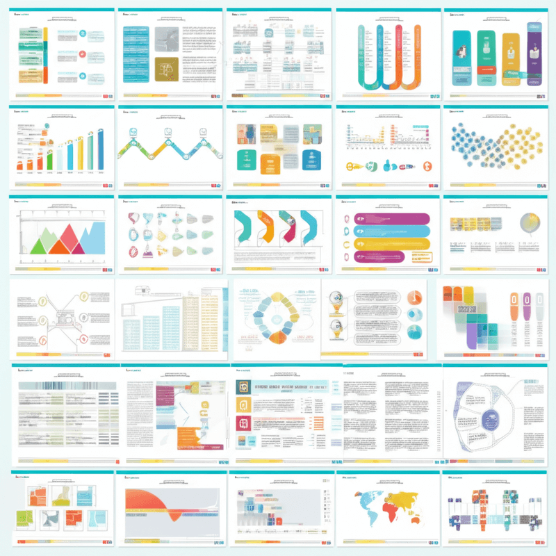
Infographic templates are pre-designed layouts that offer a foundational structure for crafting visual representations of information or data. They provide a streamlined approach to transforming complex information into easily digestible visuals. [1]
These templates typically feature placeholders for various elements such as text, images, icons, and different types of data visualizations. This structure simplifies the design process, making it more efficient and accessible for a wide range of users.
Essentially, infographic templates democratize design, enabling individuals who may not possess graphic design expertise to produce professional-looking infographics. They serve as a powerful tool for visual communication, bridging the gap between raw data and engaging presentations.
Why use them?
Utilizing infographic templates offers numerous advantages for both individuals and organizations. They significantly streamline the creation process, allowing you to produce high-quality visuals without starting from scratch.
-
They save significant time and effort, accelerating the content creation workflow.
-
They provide design consistency across different projects, reinforcing your brand identity.
-
They ensure professional quality, helping your infographics make a stronger impact.
What types exist?
Infographic templates come in various styles, each designed to suit specific data visualization needs. Selecting the appropriate type depends on the nature of the information you intend to present.
-
Statistical infographics: These are data-heavy templates, ideal for presenting numerical information, charts, and graphs to highlight trends or statistics.
-
Timeline infographics: Perfect for illustrating sequential events, these templates lay out information in chronological order, making processes or historical data easy to follow.
-
Process infographics: Designed for step-by-step guides, these templates break down complex procedures into simple, understandable stages.
-
Geographic infographics: These templates are map-based, used for visualizing data across different locations or regions.
-
Comparison infographics: Ideal for contrasting two or more items, these templates highlight similarities and differences side-by-side.
-
Resume infographics: These offer a creative, visual alternative to traditional resumes, presenting skills and experience in an engaging format.
How to Choose the Right Infographic Template?
When selecting an infographic template, key considerations include the nature of your data, the characteristics of your audience, and the template's visual organization. The right choice enhances clarity and ensures your message resonates effectively.
Match template to data?
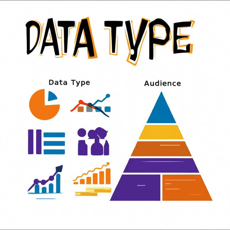
Begin by selecting a template that precisely aligns with your data type and the specific message you intend to convey. For example, if you are illustrating a sequence of events or historical progression, a timeline template would be the most suitable choice. Conversely, for data with a strong spatial component, such as population distribution or regional statistics, a map template would effectively represent the geographic information.
Consider audience and purpose?
It is crucial to understand deeply who your audience is and what specific action or understanding you want them to derive from the information presented. Whether your goal is to inform, persuade, or educate, the template you choose should support this purpose and effectively communicate to your target demographic.
Prioritize visual hierarchy?
Prioritize a template that offers a clear visual hierarchy, ensuring the design guides the viewer's eye logically through the most important information. The template should promote readability and utilize appropriate color palettes that not only align with your message but also resonate well with your intended audience, enhancing overall engagement and comprehension.
What Key Strategies Enhance Infographic Effectiveness?
Creating effective infographics goes beyond simply presenting data; it involves strategic design choices that ensure your message resonates with the audience. By focusing on clarity, visual organization, and narrative construction, you can transform complex information into engaging and easily understandable visuals. These strategies help viewers quickly grasp insights and retain important details.
The goal is to make the information accessible and impactful. This means meticulously planning how data is expressed visually and how the viewer's journey through the infographic unfolds. When these elements are skillfully integrated, infographics become powerful tools for communication.
Ultimately, an effective infographic simplifies comprehension, guides attention, and leaves a lasting impression, making it an invaluable asset for conveying information in a visually driven world.
Simplify complex data?
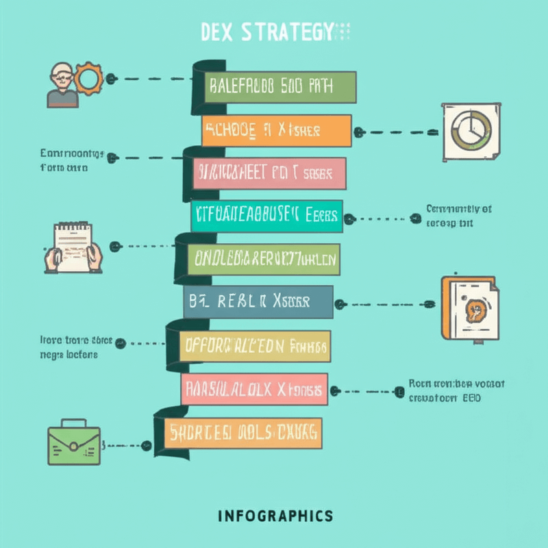
Effectively simplifying complex data involves more than just reducing its volume; it requires breaking down complicated information into digestible chunks. This process includes using clear and concise language while completely avoiding jargon that could alienate or confuse your audience. The aim is to make even the most intricate data points accessible to a broad readership.
To achieve this, consider the following:
Present information in small, manageable segments that prevent cognitive overload. Utilize straightforward vocabulary to explain concepts without oversimplification. Ensure that each data point serves a clear purpose in conveying the overall message.
Employ strategic visual hierarchy?
Employing a strategic visual hierarchy is crucial for guiding the viewer's eye seamlessly through the infographic. This involves prioritizing information based on its importance, using design elements such as size, color, and placement to direct attention. A well-defined hierarchy ensures that viewers immediately grasp the most critical information and naturally follow the intended flow.
Consider these techniques for establishing hierarchy:
Use larger fonts and more vibrant colors for primary headings and key data points to make them stand out. Place the most critical information at the top or center of the infographic for immediate visibility. Highlight key data points and insights using visual cues like arrows and annotations to draw specific attention. Employ clear visual cues, such as proximity and alignment, to show relationships between different data elements.
Utilize a storytelling approach?
A storytelling approach frames your data within a compelling narrative, transforming raw information into an engaging experience. This method involves crafting a clear beginning, middle, and end, which helps the audience intuitively understand the information and its broader significance. By weaving data into a story, you make it more memorable and relatable.
To implement a storytelling approach, follow these steps:
Start with a captivating headline that hooks the audience and clearly states the infographic's main theme or question. Develop a logical sequence of information that builds understanding step by step, much like a developing plot. Conclude with a strong summary of the key takeaways and often include a clear call to action to guide further engagement.
Which Platforms Offer the Best Infographic Templates?
Many platforms provide excellent infographic templates, each with unique strengths. Your choice depends on your specific needs, whether that's ease of use, robust data visualization, or interactive capabilities.
Canva for ease of use?
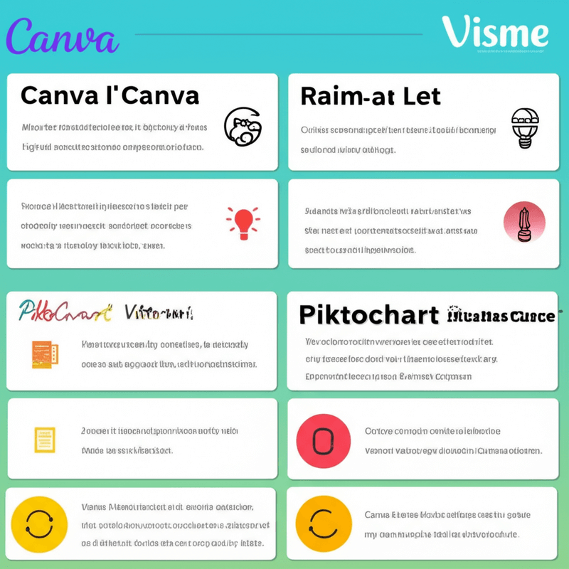
Canva is renowned for its user-friendly drag-and-drop interface, making it incredibly accessible for beginners. It offers a vast library of infographic templates, along with diverse images and icons to enhance your design. You can easily collaborate with others on projects, and the platform provides high customization options to tailor your infographics precisely.
Piktochart for data visualization?
Piktochart excels in data visualization, providing strong tools specifically designed to transform complex data into clear, compelling visuals. It offers a variety of infographic templates that are particularly effective for presentations, ensuring your data is not only understood but also visually engaging. The platform maintains good usability, making it straightforward to create impactful data-driven infographics.
Visme for interactive elements?
Visme is a comprehensive tool that goes beyond standard infographics, allowing for the creation of presentations and videos as well. It stands out for its ability to incorporate interactive elements, which can significantly enhance engagement with your audience. Visme also supports data import for seamless integration and offers tools for maintaining brand consistency, all while providing high customization for your designs.
What are Current Infographic Design Trends and Best Practices?
What are marketing trends?
Current marketing trends in infographic design are shifting towards more dynamic and engaging formats. Interactive infographics allow users to explore data at their own pace, while micro-infographics are perfectly suited for quick consumption on social media platforms. There's also a strong emphasis on data storytelling, aiming to create an emotional connection with the audience rather than just presenting facts. [2]
Other notable trends include:
-
Personalization: Tailoring infographic content to individual user preferences or segments.
-
AR/VR for immersive experiences: Utilizing augmented and virtual reality to provide deeply engaging data visualizations.
-
Accessibility emphasis: Ensuring infographics are usable and comprehensible for individuals with diverse needs.
When it comes to best practices in marketing infographics, clarity and visual impact are paramount. You should always strive for clear messaging supported by strong visuals.
-
Effective data visualization practices are crucial for presenting complex information understandably.
-
Strategic use of whitespace improves readability and guides the viewer's eye.
-
Designing for mobile-first ensures optimal viewing on smartphones and tablets.
-
A/B testing different designs helps in optimizing performance and engagement.
What are education trends?
Educational infographic trends are moving towards more interactive and engaging learning experiences. Gamification incorporates game-like elements to make learning more enjoyable, while interactive simulations allow learners to actively participate in understanding concepts. Video and animation are increasingly used to explain complex topics dynamically.
Additional trends include:
-
Personalized learning: Adapting infographic content to suit individual learning styles and paces.
-
Modular design: Breaking down information into smaller, digestible units that can be recombined.
-
Accessibility features: Designing educational infographics to be inclusive for all learners.
Best practices for educational infographics focus on making information digestible and effective for learning. Using simple language ensures that complex topics are easily understood by the target audience, and an appealing design maintains engagement.
-
Visual hierarchies help organize information logically and guide learners through the content.
-
Consistent branding provides a professional and trustworthy appearance.
-
Incorporating interactive elements encourages active participation.
-
Including assessment components allows for testing comprehension and reinforcing learning.
What are business reporting trends?
Business reporting trends in infographics are emphasizing clarity, interactivity, and a focus on key performance indicators (KPIs). Dashboard-style infographics provide a snapshot of essential metrics, while interactive data exploration allows stakeholders to delve deeper into specific data points. There's also a significant focus on data security given the sensitive nature of business information. [3]
Emerging trends include:
-
Focus on KPIs: Highlighting the most critical metrics for business performance.
-
Data security: Implementing measures to protect sensitive business data presented in infographics.
-
Storytelling approach: Presenting business data within a narrative to make insights more compelling.
For business reporting, best practices revolve around accuracy, consistency, and effective communication of insights. Accurate data is non-negotiable, forming the foundation of reliable reports. Consistent design throughout all reports reinforces professional credibility.
-
Effective visualization techniques ensure complex data is immediately understandable.
-
Concise summaries provide quick overviews of key findings.
-
Strategic use of color effectively highlights trends and patterns.
-
Ensuring accessibility means that all stakeholders can access and understand the reports.
How to Optimize Your Infographic Template Usage?
You can significantly enhance the effectiveness of your infographic templates by focusing on key optimization strategies. These methods ensure your visuals are not only appealing but also highly impactful and professional.
Conduct testing and iteration?
Before you publish your infographic, test it with your target audience to gauge its effectiveness. Collect their feedback and make necessary revisions. User testing helps identify areas for improvement, allowing you to analyze input and refine both the design and the messaging.
Ensure brand consistency?
Choose infographic templates that align seamlessly with your brand's identity. Customize these templates to reflect your unique content and data. It is crucial to maintain consistency in fonts, colors, and design elements across all your infographics to reinforce brand recognition.
Utilize high-quality assets?
Always use high-quality images, icons, and graphics within your infographic templates. This practice maintains a professional appearance and ensures the clarity of your message. Regularly update your templates to reflect evolving design trends, which will help ensure optimal performance and engagement.
Frequently Asked Questions about Infographic Templates (FAQ)
Can beginners use them effectively?
Yes, infographic templates are designed to be user-friendly, allowing individuals without graphic design experience to create professional visuals. You can easily drag and drop elements, input your data, and customize the design to fit your needs. These templates democratize visual communication, making it accessible to a wider audience.
Are free templates sufficient for professional use?
Free templates can be a good starting point for your projects, especially if you are just beginning to explore infographic creation. However, premium templates often offer more extensive customization options, advanced features, and a wider range of unique designs. For complex or high-stakes professional projects, the enhanced capabilities and distinctive aesthetics of premium templates may be necessary to convey your message effectively and stand out.
How important is data accuracy?
Data accuracy is paramount when creating infographics. Even the most visually stunning infographic is rendered useless if the underlying data is flawed or misrepresented. Always double-check your sources thoroughly and ensure your visualizations accurately reflect your data. The integrity of your infographic hinges on the precision of the information you present, building trust with your audience.
Conclusion
Infographic templates are powerful tools that simplify the creation of compelling visual content. They make complex information accessible and engaging for your audience.
By understanding how to choose, customize, and optimize these templates, you can effectively communicate your message, enhance brand awareness, and drive engagement across various platforms. Embrace these resources to transform your data into impactful stories that resonate with your audience and achieve your communication goals.
References
[1] Smiciklas, M. "The Power of Infographics: Using Pictures to Communicate and Connect with Your Audience." Pearson Education, 2012. https://www.pearson.com/us/higher-education/program/Smiciklas-Power-of-Infographics-The-Using-Pictures-to-Communicate-and-Connect-with-Your-Audience-1st-Edition/PGM285705.html [2] Lima, M. "Visual Complexity: Mapping Patterns of Information." Princeton Architectural Press, 2011. https://architexturez.net/doc/az-cf-180479 [3] Cairo, A. "The Functional Art: An Introduction to Information Graphics and Visualization." New Riders, 2012. https://a.co/d/2v2A17X
Continue in Recap
Turn this source into a Recap Document
Make it easier to read, then send time-based details to Calendar, export it to Workspace, or start PBL Learning.