

Introduction
In today's information-rich world, cutting through the noise and conveying complex data effectively is paramount. Infographics serve as powerful tools for visual storytelling, transforming intricate information into digestible, engaging visuals.
This article will guide you through the art and science of infographic design, from fundamental principles and best practices to essential tools and emerging trends. Whether you're a beginner looking to create your first infographic or a seasoned designer seeking to refine your skills, you'll find actionable insights to craft impactful visual narratives.
Use this guide for the design fundamentals. If your need is narrower, see how to choose and customize an infographic template, optimize an infographic for search, or design an infographic for social media.
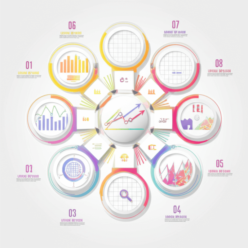
What are the core principles of effective infographic design?
Effective infographic design is built upon several foundational principles that ensure clarity, engagement, and accuracy. These principles guide designers in transforming raw data into compelling visual narratives.
Understanding and applying these core principles is crucial for creating infographics that not only look good but also effectively communicate their intended message and resonate with the audience.
How does clarity impact design?
Clarity and simplicity are paramount in infographic design, focusing on delivering a clear message while avoiding unnecessary clutter. This means using concise text, straightforward visuals, and ensuring a logical flow of information that is easy for the audience to follow.
-
Text labels should be concise, conveying information without excessive wording.
-
A minimalist design approach helps reduce visual noise and keeps the focus on essential data.
-
Information should be structured with a logical data hierarchy, presenting details in a sensible order.
-
Establishing a clear visual hierarchy guides the viewer's eye through the most important elements first.
Why is visual hierarchy important?
Visual hierarchy guides the viewer's eye through the information, using elements such as size, color, and placement to emphasize key details. This can involve varying font and image sizes, using contrasting colors, strategically placing elements from top to bottom or left to right, and effectively utilizing white space to separate and highlight content.
What is the role of accessibility?
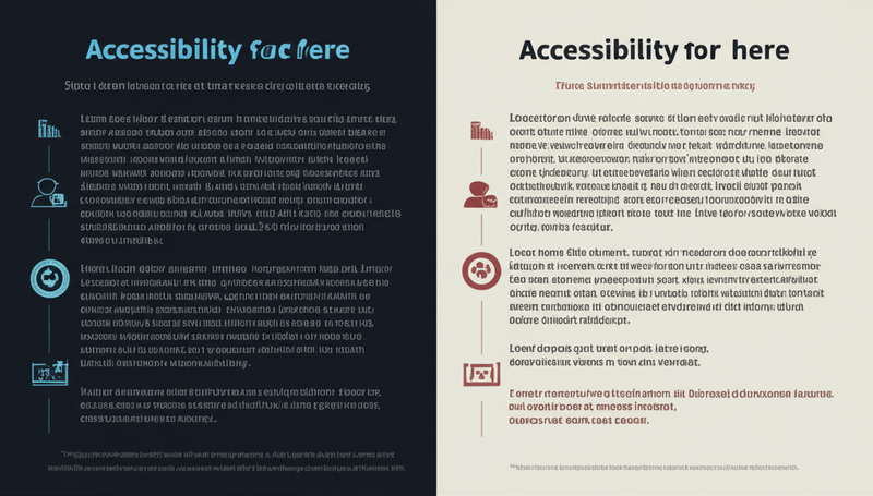
Accessibility and inclusivity ensure that the infographic is understandable and usable by individuals with disabilities. This involves considering various needs, such as color blindness, low vision, and other factors that might affect comprehension.
-
Sufficient color contrast should be used to make text and graphics easily distinguishable for all viewers.
-
Alternative text for images allows screen readers to convey visual information to users who cannot see the images.
-
Clear font choices, such as sans-serif fonts in readable sizes, improve legibility for a wider audience.
-
Design considerations should extend to compatibility with screen readers, ensuring content can be accessed audibly.
How does storytelling enhance engagement?
Storytelling enhances engagement by presenting information in a narrative format, which captures the audience's attention and makes the content more memorable. This approach helps users connect with the data on a deeper level, making complex information more digestible and impactful.
-
A compelling narrative structure helps guide the audience through the infographic's content, building connections between data points.
-
Visuals strategically support the unfolding story, illustrating concepts and reinforcing key messages.
-
Infographics can forge an emotional connection with the audience, making the information more relatable and resonant.
-
If applicable, a clear call to action within the narrative encourages viewers to take the next desired step.
What does consistency mean in design?
Consistency in design means maintaining a uniform visual style throughout the entire infographic, including consistent font choices, a cohesive color palette, and a regular arrangement of visual elements. If applicable, the design should also align with brand guidelines, incorporating elements such as the brand logo and specific colors to reinforce identity.
How do you choose the right data visualization for an infographic?
Choosing the appropriate chart or graph type is critical for accurately and effectively representing the data within an infographic. The choice depends on the type of data and the specific message you want to convey. You should always select a visual that clearly communicates your information, avoiding anything that might mislead or confuse your audience.
What are common chart types?
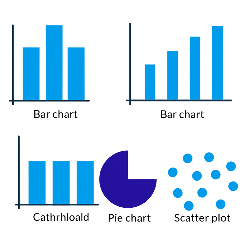
Several common chart types are frequently used in infographic design, each suited for different kinds of data representation.
-
Bar charts effectively compare quantities across different categories.
-
Line charts clearly show trends or changes in data over a period of time.
-
Pie charts illustrate static proportions and parts of a whole dataset.
-
Scatter plots reveal relationships or correlations between two different variables.
When should you avoid misleading visuals?
You should avoid misleading visuals at all times to ensure accurate data representation. This means ensuring that all scales are correct and that proportions are precisely maintained. Distortion of data should be entirely avoided, as should unnecessary 3D effects or decorative elements that might obscure the actual data. Clear axes and labels are essential for readability and understanding, making sure your infographic design communicates information precisely without any confusion.
What are the best tools for creating infographics?
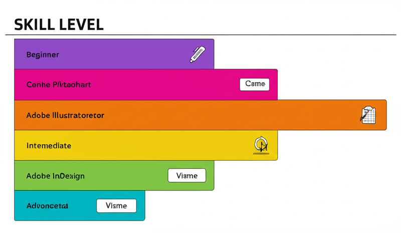
The market offers a wide array of tools for infographic design, catering to different skill levels and project requirements. Selecting the right tool can significantly impact your workflow and the quality of your output.
Canva is a user-friendly option featuring a drag-and-drop interface and a vast library of templates, images, and elements. It excels in ease of use, provides an extensive template library, and offers affordable pricing with collaboration features. However, it presents limited customization for advanced users, and some templates might feel generic. Canva is best for beginners, non-designers, and quick projects.
Piktochart is another user-friendly infographic maker that includes pre-designed templates and a wide array of customization options. It is easy to use and offers a variety of templates, making it good for data visualization. A potential drawback is fewer advanced customization options compared to Illustrator, and pricing can be restrictive for some users. Piktochart is suitable for beginners to intermediate users and data visualization.
Visme is a versatile tool that allows you to create infographics, presentations, and reports. It offers a good balance between ease of use and advanced features. This versatile platform is good for various content types and includes collaboration features, with interactive elements available. It can be slightly less user-friendly than Canva for complete beginners, and its pricing structure may not suit all budgets. Visme is ideal for beginners to intermediate users, interactive infographics, and presentations.
Adobe Illustrator is an industry-standard vector graphics editor. It is highly customizable and powerful, but it requires a steeper learning curve. Its pros include unmatched customization, vector-based graphics for scalability, and professional results. The cons are an expensive subscription, a steep learning curve, and it is not ideal for quick projects. Illustrator is best for experienced designers, complex infographics, and high-quality print.
Adobe InDesign is a powerful page layout software ideal for multi-page infographics and publications. It offers excellent control over typography and design elements. This tool provides precise control over layout and excellent typography features, making it ideal for multi-page infographics. However, it comes with an expensive subscription, a steep learning curve, and is not as intuitive as Canva. InDesign is best for experienced designers, multi-page infographics, and professional publications.
Which tool is best for beginners?
For beginners, Canva is an excellent choice due to its user-friendly, drag-and-drop interface and extensive template library. It simplifies the design process, allowing those new to infographic design to create visually appealing content quickly and efficiently without needing prior design experience.
Which tool is best for professionals?
Adobe Illustrator stands out as the best tool for professionals due to its unmatched customization capabilities and vector-based graphics, ensuring high-quality, scalable results. While it has a steep learning curve, its power and precision are ideal for experienced designers working on complex infographic design projects that demand professional-grade output.
Are there tools for interactive design?
Yes, tools like Visme offer features for interactive design within infographics. Visme allows users to embed interactive elements, which can include pop-ups, hover effects, and links, enhancing user engagement and providing a dynamic viewing experience beyond static images.
What are the best practices for publishing and optimizing infographics?
Beyond creation, the effectiveness of an infographic hinges on how it is shared and optimized for its intended audience and platforms. Adhering to best practices ensures maximum reach and impact for your infographic design.
One key practice is clear and concise storytelling. Develop a compelling narrative that guides the viewer through the data and key takeaways. Begin with an engaging hook, build to a clear climax, and end with a strong call to action.
Another crucial element is effective data visualization. Choose appropriate chart types for your data and keep the visuals clean, simple, and easy to understand. Avoid unnecessary "chart junk" and ensure all data labels are clear and concise for better comprehension.
Consistent branding and design are also vital. Maintain a cohesive visual identity throughout the infographic using consistent fonts, colors, and imagery. This creates a professional and polished look, reinforcing your brand.
How important is mobile-first design?
Designing infographics with mobile devices in mind is extremely important. You must ensure the layout and visuals are responsive, adapting well to different screen sizes, as a significant portion of content consumption now occurs on smartphones and tablets. This approach for infographic design guarantees a positive user experience across all devices.
Why optimize for platforms?
Optimizing infographics for various platforms, such as social media, websites, and email, is essential to maximize reach. Different platforms may require different formats, such as static images, GIFs, or interactive web pages, to best suit their native display capabilities and user engagement patterns.
How can user testing improve design?
User testing and iteration significantly improve infographic design. By testing infographics with target audiences, you can gather valuable feedback and identify areas for improvement. This iterative process allows you to refine and enhance designs based on real-world user interaction and understanding.
What are the ethical considerations for data?
Ethical considerations for data in infographic design include ensuring data accuracy and always citing your sources. It is crucial to maintain transparency and credibility in data representation. Additionally, with the increasing use of data, infographics should carefully consider and address potential privacy concerns, particularly when dealing with sensitive information, to protect user data.
What are the latest trends in infographic design?
The field of infographic design consistently evolves, propelled by new technological advancements and shifting user preferences. Keeping current with these emerging trends can give your designs a distinct advantage.
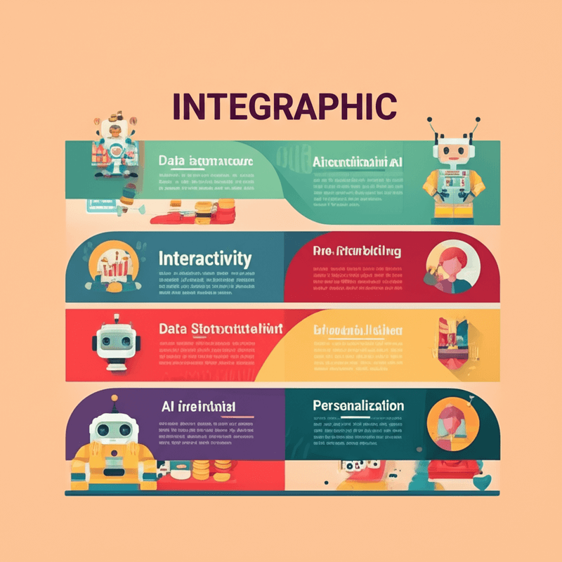
How are infographics becoming interactive?
Infographics are increasingly interactive, empowering users to explore data at their own pace and delve deeper into specific attributes. This interactivity includes features such as hover-over details, clickable elements that reveal more information, and embedded videos or animations that enhance the visual experience. Furthermore, designers are incorporating micro-interactions and gamification elements, like progress bars or interactive quizzes, to heighten user engagement.
What is data storytelling with emotion?
Infographics are moving beyond mere data presentation to integrate compelling narratives that elicit emotional responses. This approach involves using specific visuals and language to connect with the audience on a deeper level, making complex data more relatable and memorable. Motion graphics and animation also contribute to creating more engaging visuals, clarifying complex information and emphasizing key insights.
Is AI impacting design creation?
Artificial intelligence tools are emerging to assist in the creation of infographics. These AI capabilities can automate tasks such as data visualization and layout generation. This automation allows designers more time to focus on the human aspects of design, such as storytelling and other creative elements.
How does personalization affect infographics?
Personalized infographics are becoming more prominent, utilizing data analysis and specialized tools to tailor content and visualizations for individual users. This customization leads to improved engagement and greater knowledge retention for the audience. Additionally, designers are prioritizing accessibility and inclusivity by ensuring their infographics are understandable and usable for people with disabilities through features like alt text for images, proper color contrast, and clear language.
Frequently Asked Questions about Infographic Design (FAQ)
Do I need design skills to create infographics?
You do not need formal design skills to create compelling infographics. Many user-friendly tools, such as Canva, Piktochart, and Visme, offer intuitive platforms. These tools provide templates and drag-and-drop interfaces that enable individuals without extensive design training to produce professional-looking infographics.
How long should an infographic be?
The ideal length of an infographic varies depending on its content and purpose. Generally, an infographic should be long enough to convey its story clearly and comprehensively without including unnecessary clutter. The most effective infographics are concise and designed for quick scanning, ensuring that key information is easily digestible.
Can infographics improve SEO?
Yes, infographics can significantly enhance your search engine optimization (SEO) efforts. They are highly shareable across various platforms, which helps to attract valuable backlinks to your site. Infographics also tend to increase the time users spend on a page, signaling to search engines that your content is engaging. Furthermore, well-optimized infographics can rank in image search results, all contributing to improved search engine visibility.
Conclusion
Infographic design stands as an indispensable skill in the modern digital landscape. This powerful tool offers a unique way to simplify complex data and engage diverse audiences effectively. By mastering fundamental design principles, leveraging appropriate tools, and embracing emerging trends, you can craft compelling visual narratives that leave a lasting impact.
Continuously refining your understanding of data visualization, accessibility [1], and storytelling will ensure your infographics not only convey information effectively but also stand out in an increasingly visual world. Begin designing today and tell your story with significant impact.
References
[1] Lattner, W. C., & Lattner, W. C. (2018). Information Visualization: Perception for Design. Morgan Kaufmann. https://books.google.com/books/about/Information_Visualization.html?id=oP8WvgAACAAJ [2] Cairo, A. (2016). The functional art: An introduction to information graphics and visualization. New Riders. https://www.google.com/books/edition/The_Functional_Art/42u2CgAAQBAJ [3] Tufte, E. R. (2001). The visual display of quantitative information. Graphics Press. https://www.edwardtufte.com/tufte/books_vdqi [4] Nielsen Norman Group. (2020). Infographics: Designing for Comprehension. https://www.nngroup.com/articles/infographics-design/ [5] Few, S. (2011). Show me the numbers: Designing tables and graphs to enlighten. Analytics Press. https://www.perceptualedge.com/books/SMTN2_toc.pdf
Continue in Recap
Turn this source into a Recap Document
Make it easier to read, then send time-based details to Calendar, export it to Workspace, or start PBL Learning.