

Introduction
Infographics help people understand complex information quickly on social media. A clear chart or visual can stop a scroll, explain one idea, and give people something worth sharing.
This guide focuses on the choices that matter when an infographic will be published on social platforms: format, message, accessibility, branding, and the next action you want a viewer to take.
If you are still working out layout, chart choice, or visual hierarchy, start with the infographic design guide. For search-focused publishing and backlink outreach, use the SEO infographic guide.
What makes a social media infographic effective?
Social media infographic design turns data or a longer explanation into a visual that can be understood quickly. The goal is to help someone grasp the point and decide whether to act or share it.
Infographics are easy to share when they explain one useful point clearly. They can turn raw data or a long explanation into something a viewer can understand in a few seconds.
Why use infographics on social media?
Use an infographic when the message is easier to understand as a comparison, sequence, map, chart, or checklist than as a block of text.
-
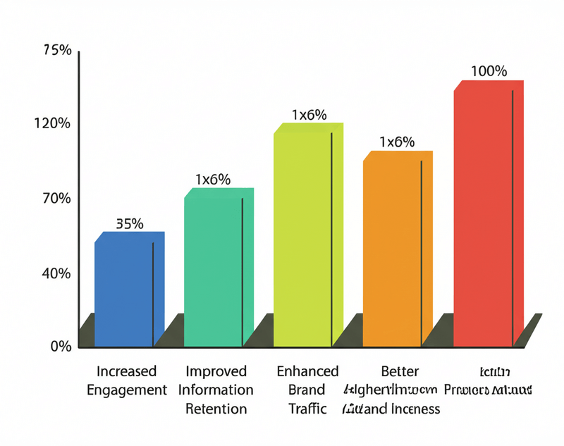
Visuals are processed 60,000 times faster than plain text, leading to improved retention of information. [1]
-
Web posts that include visuals achieve 650% more engagement compared to those that are text-only. [2]
-
When optimized with clear calls to action, infographics can substantially increase website traffic. [3]
What are the main principles?
Effective social media infographic design adheres to several core principles that ensure clarity, engagement, and accessibility.
-
Clarity and simplicity: Avoid overwhelming your audience with too many visuals. Use concise text and data that people can understand at a glance.
-
Visual hierarchy: Use size, color, and placement to guide the viewer's eye. Start with the main data point.
-
Color: Choose colors that support the message and follow your brand guidelines.
-
Typography: Choose legible fonts and limit the number of typefaces in one design.
-
White space: Leave enough space around elements to keep the design readable. Remove information that does not support the main point.
-
Storytelling: Build a clear sequence so the viewer can follow the message from start to finish.
-
Accessibility: Design for people with disabilities. Use sufficient color contrast, provide alt text, and write clear captions.
How do you design visuals for social media?
Creating an effective social media infographic starts with one message and one intended action. Use images, icons, and illustrations only when they help the viewer understand that message.
What are the practical design choices?
Start with the audience and where the post will appear. That context should determine the format, amount of text, and level of detail.
-
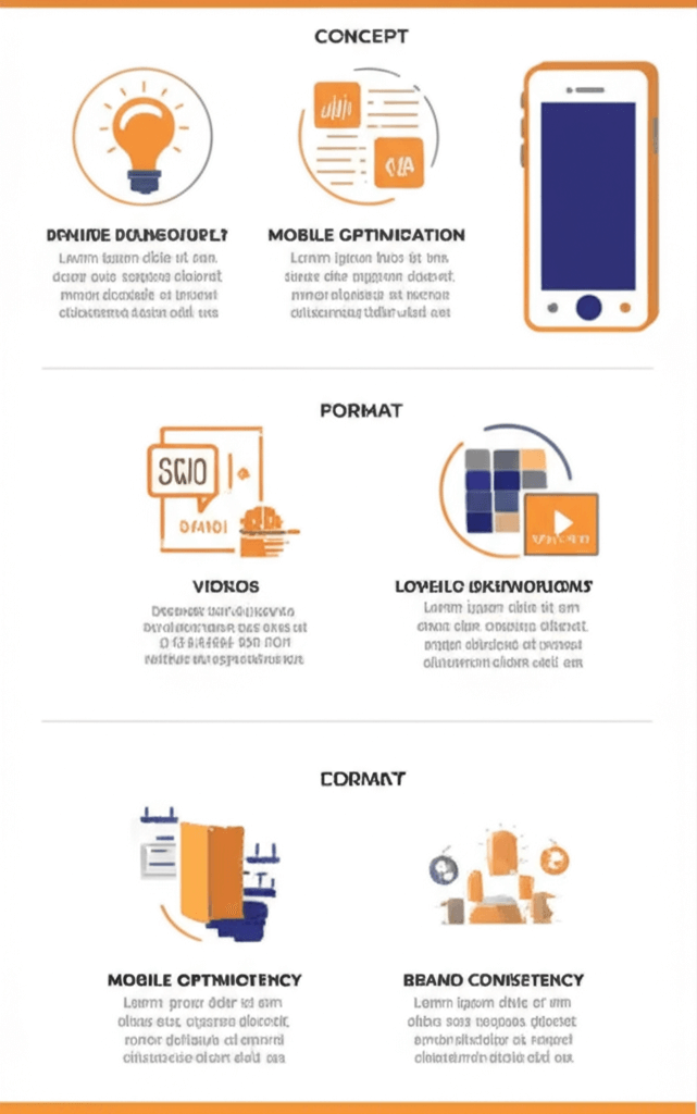
Start with one concept and a clear objective.
-
Choose the right format for each platform; for example, use square layouts for Instagram and landscape orientations for LinkedIn.
-
Check the design on a phone before publishing it.
-
Maintain brand consistency across all your designs.
How do I maintain brand consistency?
Use the same voice, colors, type, and logo placement across a series of infographics. A viewer should recognize the source without branding getting in the way of the information.
What drives engagement with social media infographics?
An effective social media infographic pairs a useful message with a format that suits the platform. The following choices can make the post easier to understand and act on.
How can the message stay concise and clear?
Focus each social media infographic on one message. A viewer should be able to identify the main point without reading every label.
-
Write short sentences that convey information directly.
-
Use bullet points when they make complex information easier to scan.
-
Avoid jargon and overly technical language that might alienate a broad audience.
What role does storytelling play?
Arrange the data in a sequence that answers a question or shows how something changes. A problem and solution structure often works well because it gives the viewer a clear path through the infographic.
How should I use calls to action and hashtags?
A call to action should ask for one specific response. Hashtags can help with discovery, but they should match the subject and the platform.
For example, your CTA could encourage your audience to:
-
"Visit our website for more details."
-
"Follow our profile for daily insights."
-
"Share this infographic with your network."
Research the terms people already use for the subject. A small set of relevant hashtags is more useful than a long list of broad ones.
Which tools work best for infographic design?
Choose a tool based on the work you need to do. Vector editors suit custom illustrations, data tools suit charts, and template platforms suit fast production.
Which tools are suited to vector graphics?
Vector graphics editors create illustrations and icons that stay sharp at different sizes. This is useful when the same infographic will be adapted for several platforms.
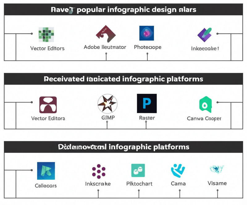
Common vector graphics editors include:
-
Adobe Illustrator: This professional software includes tools for vector drawing, logo design, and detailed infographic illustration.
-
Affinity Designer: This Illustrator alternative supports precise technical drawings and custom infographic elements.
-
Sketch: This tool is useful for clean, scalable vector assets that can be added to a social media infographic.
What about raster editors and infographic platforms?
Raster editors and infographic platforms solve different problems. Raster editors are suited to photo editing and composite images. Template platforms are faster when you need a repeatable layout.
The tools fall into these categories:
-
Raster graphics editors:
-
Adobe Photoshop: Photoshop handles photo editing and composite visuals for an infographic.
-
GIMP: This open source editor can prepare raster images for a social media infographic.
-
Canva: Canva includes basic raster editing for quick adjustments to images used in a design.
-
Data visualization tools:
-
Tableau: Tableau can turn complex datasets into interactive charts and graphs for data-driven infographics.
-
Power BI: Microsoft's data visualization tool can turn complex information into charts and dashboards for an infographic.
-
Google Data Studio: This free tool offers an intuitive way to transform raw data into informative and customizable charts and reports, perfect for integrating clear data visualizations into your social media infographic design.
-
Infographic creation platforms:
-
Canva: Canva offers templates, fonts, and graphics for producing social media infographics quickly.
-
Piktochart: This platform specializes in infographic templates and icons for data presentation.
-
Visme: Visme supports interactive elements and customizable infographic templates.
Which newer formats are useful for social media infographics?
Social platforms now support motion, interactive elements, and personalized visuals. Each format adds production work, so use it only when it makes the information easier to understand.
What are short-form video infographics?
Short-form video infographics use motion to explain a chart, process, or comparison on TikTok, Instagram Reels, and YouTube Shorts. This format lets people absorb the main point quickly.
How do interactive and personalized infographics work?
Interactive infographics can include polls, quizzes, or clickable areas. Personalized infographics change the information shown based on user data or preferences. A sports brand might let viewers select a sport to reveal related statistics. A financial service might generate a chart from a user's spending categories.
What about motion graphics and AR infographics?
Motion can reveal data in stages or show how a process changes over time. Augmented reality infographics place interactive information in a physical setting through a phone camera. Use either format only when the interaction helps explain the subject.
How can businesses use infographics?
Businesses can use infographics to explain complex information in a format that is easy to share. The format works best when it supports a specific marketing or communication goal.
How do they support content marketing?
Infographics can explain a product, summarize a report, or turn a longer article into a social post. You can share the full visual, crop individual sections for different platforms, and embed the original on your website.
What role do they play in lead generation?
For lead generation, an infographic can point to a related download, signup page, or interactive resource. Track clicks and completed forms so you can tell whether the visual is sending qualified visitors to the next step.
Can they build brand awareness?
Infographics can build brand recognition when they use a consistent visual system. Keep the logo, type, colors, and tone recognizable without letting branding crowd out the information.
Frequently asked questions about social media infographic design
How often should I post infographics?
There is no universal posting frequency. Start with a schedule your team can maintain, then compare saves, shares, clicks, and completion rates across several posts.
What size should I use on each platform?
The ideal dimensions for your social media infographic design fluctuate significantly across various platforms to ensure optimal display and engagement.
Common starting sizes include:
-
Instagram commonly uses square infographics (1080x1080 pixels) or vertical formats (1080x1350 pixels).
-
Facebook offers flexibility, accommodating both horizontal and vertical designs depending on the placement. Examples include 1200x630 pixels for shared links or 1080x1350 pixels for feed posts.
-
LinkedIn commonly uses horizontal infographics (1200x627 pixels) or square formats.
Can I repurpose old data into new infographics?
Yes. Update the data first, then adapt the layout and caption for each platform. Do not repost an old visual if its numbers or sources are no longer current.
Conclusion
Good social media infographic design makes one useful idea easy to understand on a small screen. Clear hierarchy, readable type, accurate data, and a format suited to the platform matter more than decoration.
Publish a small set of formats, measure how people respond, and revise the next version. The best design is the one that helps the intended audience understand the message and take the intended next step.
References
[1] L. J. King. "Visuals are processed quicker than text: How to use this to your advantage in content marketing." MarketingProfs, 2017. Link
[2] HubSpot. "The Ultimate List of Marketing Statistics for 2024." HubSpot Blog, 2024. Link
[3] N. Patel. "Why Visual Content Will Dominate 2024." Neil Patel Blog, 2024. Link
Continue in Recap
Turn this source into a Recap Document
Make it easier to read, then send time-based details to Calendar, export it to Workspace, or start PBL Learning.